Tuesday 13 October 2009

Environment / Typography / Environment

The three areas I chose to focus my research and base my typefaces on for this brief are:
- BMX
- Man made patterns
- Naturally occurring forms

I decided to draw out some spider diagrams looking at the things I am interested in in these areas.


The areas I am most interested in researching are:

Tyre tread
Windows OR Slates
TV Ariels
Urban Decay
Lights? (City lights at night)
Water - Ripples, Splash, Droplets, Dappling
Leaves
Tree bark, rings

My research will mostly take the form of photography.

Having considered the visual possibilities for all my research areas, I think the things I am most excited about are the naturally occurring forms. I don't know how much I can draw from BMX in this context, so I am considering dropping this as an area of research and focusing on man made patterns and naturally occurring forms. I think typefaces based on these will work together as a set more effectively as well.

Monday 12 October 2009

Work Experience

This is a poster I completed during my work experience. It was for the greatstreetgames.org.uk event which I also designed a logo for. I don't thgink they decided to use the poster in the end, but I was pleased with it as a piece of work and wanted to keep a hard copy so I printed one out in digital print.


Headline Development

Some quick, early ideas for the headline brief.

After a few early ideas I settled on a layout similar to this. I wanted to keep my design really simple. I was originally planning to screen print the design.


After seeing these postage stamps from the 1912 Gordon Bennett balloon race I was quite interested in making my design in the style of a postage stamp.


Here I looked at some more adventurous use of colour. However I felt that my design was too similar to the postage stamps and I wanted to do something more typographic. I'm not an Illustrator and I felt this idea was relying too heavily on the image of the balloon.


So, I further developed the hand drawn typography which I had previously only used for the word 'Paris' so that it could become the centre piece of the poster.

I feel much happier going with this direction.


Experimentation with colour.


This is the stage I am at now. I did a test on A3 newsprint in sky blue ink. I chose newsprint because I wanted something fragile and ephemeral, like it really was a poster for the 1906 Paris balloon race. Newsprint also has an aged quality which I felt was appropriate.

I have to do some fine tuning to the design and make my final decision on colour and paper stock and the piece will be finished.

Thursday 8 October 2009

Leeds Public Art Proposal


Me and Patrick finished our proposal for the Leeds City Council public art publication. I'm pretty happy with the result but I think their is some stiff competition. We had to submit 2 double page spreads (including a flow chart) and a front cover, we decided to submit an extra dps just to show how they would work with a greater or lesser quantity of text.


Front and Back cover


Flow Chart


Dps 1


Dps 2


Leeds Public Art Flow Chart

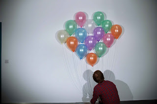
We wanted to continue the theme of photographic type and graphics in the environment for the flow chart. Here are some of the images taken.


The type is going to be overlaid onto the balloons to make the flow chart.

Leeds Public Art Photos

Patrick and I have been working on our proposal for the Leeds City Council public art publication. We decided to place typography outdoor, natural, scenic situations for the front cover. We felt this was appropriate because the publication uses a lot of photos from a recent public art initiative.

Here are some of the results:


Wednesday 7 October 2009

Beauty in the Ordinary Test Shots


Our fist attempt at placing typography in the environment and photographing it wasn't so successful. We used the vinyl cutter to cut out the letters. which was good although we didn't realise how much harder to cut through a layer of ink makes the vinyl and we had to try it several times. The red colour we had chosen for the type photographed really badly and almost glows in the image, making it unpleasant to look at and difficult to read. We also agreed that a stone floor wasn't the best background to our image and that it should be something more natural. I am confident our next attempt will be a lot better.

Monday 5 October 2009

Headline


For my Headline brief I'm focusing on this funny little article I found burried on page 38 of the Saturday Guardian. It was first printed on the first of October 1906 and it covers the Paris hot air balloon race. I thought it was such a cool and nostagic subject that it would be good to base my brief on. I also thought that there would be a lot of interesting visuals that I could work with.


I started developing some type. I added the highlights on Illustrator, I tried a couple of different types. The top Paris has more pointed, narrower highlights and the one below has more rounded ones. I would have thought that pointed narrower ones would have looked better but I actually prefer the rounded ones.

Originally I just tried one word but then I thought I would try the whole title in hand rended type.
I am pretty happy with how they turned out. I am continuing to develope the rest of the poster.